[mks_dropcap style=”square” size=”52″ bg_color=”#3a962e” txt_color=”#ffffff”]B[/mks_dropcap]Being a startup founder you have to take care of ALOT of things, the most important of which is presentation of your content. At Startup.pk, we have compiled a list of things which you need to know to ensure that you are making your every second count [mks_highlight color=”#3a962e”]by converting visitors into customers.[/mks_highlight]
Use these tips to build a competitive advantage over your competitors.
[mks_separator style=”double” height=”5″]
Personality Of Content
[mks_separator style=”double” height=”5″]
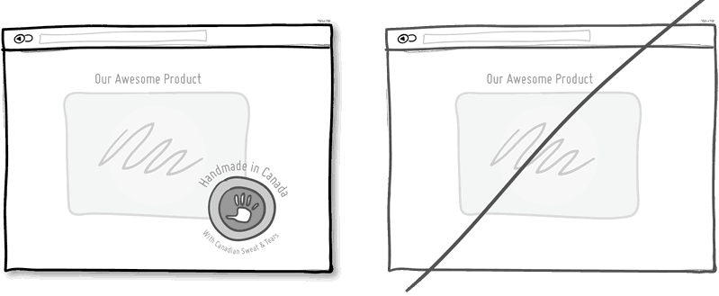
[mks_highlight color=”#3a962e”]Introduce yourself or your product with a specific catchy name, picture to make your communication more personal.[/mks_highlight] Mentioning the country, state or city of origin is a good way to begin. Doing so would make you sound a bit friendlier.
Often, stating where your product is originating from also has a pretty good chance of making its high quality known and reeling in people.
[mks_separator style=”double” height=”5″]
Social Proof
[mks_separator style=”double” height=”5″]
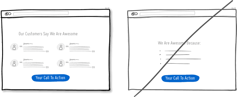
Social proof is the great persuasion tactic directly applied to increasing conversion rates. A great way to reinforce a call to action can be made by
Showing your following and your endorsement by others or data showing that others are present which gives proof.
[mks_separator style=”double” height=”5″]
Merging Similar Actions
[mks_separator style=”double” height=”5″]
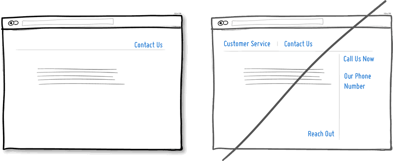
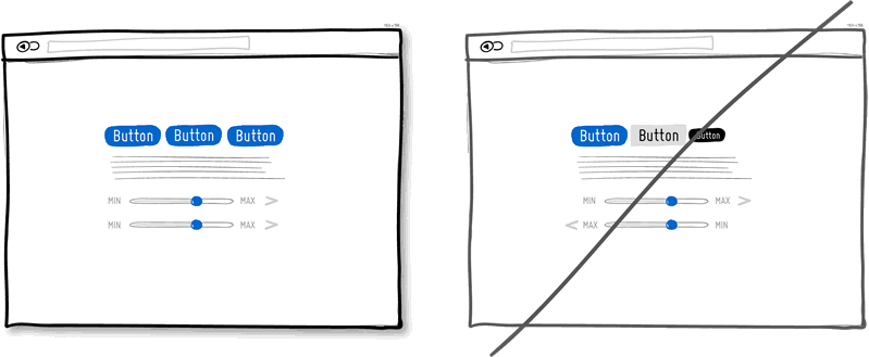
It’s easy to unintentionally create multiple sections, elements and features which all perform the same function.
Try not to create duplicate functions labeled in different ways.
Create an easy and a higher learning curve by merging similar functions together.
[mks_separator style=”double” height=”5″]
Repeat Your Primary Actions
[mks_separator style=”double” height=”5″]
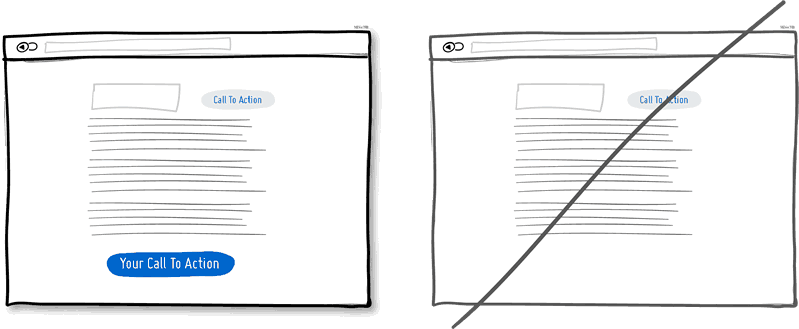
Also, try not to display your offer 10 times all on the same screen and annoy people. [mks_highlight color=”#3a962e”]It will be more beneficial to have one soft actionable item at the top, and other prominent one at the bottom.[/mks_highlight]
When people reach the bottom, they pause and think what to do next so that is where your next action plan should be.
[mks_separator style=”double” height=”5″]
Recommendation Or Equal Choices
[mks_separator style=”double” height=”5″]
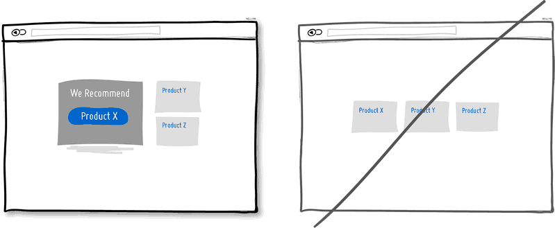
When showing multiple offers, it is a good idea to emphasize product suggestion. [mks_highlight color=”#3a962e”]Numerous choices make it difficult for a lot of people to select [/mks_highlight]and decide and they always need an extra push.
Recommend where you can.
[mks_separator style=”double” height=”5″]
Prompting For Confirmation
[mks_separator style=”double” height=”5″]
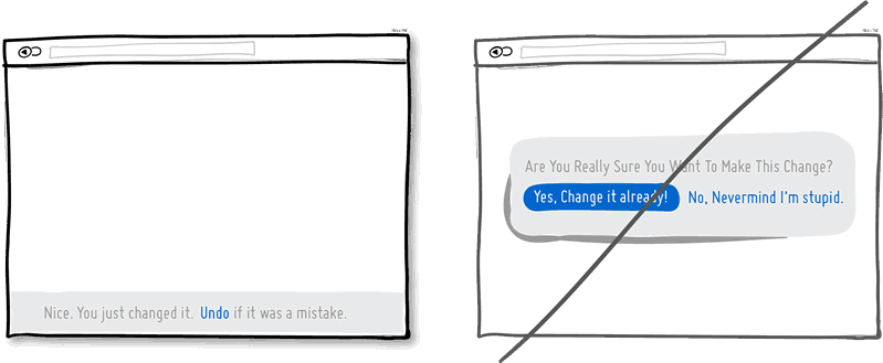
Undo options create a gap for error which is human and trust whereas [mks_highlight color=”#3a962e”]Prompts suggest to the user that they do not know what they are doing by questioning at all times.[/mks_highlight] The inefficiency and ugliness of prompts is that they are not appreciated by users when they have to perform actions repeatedly and are prompted numerously over and over.
Consider making your users feel more in control by creating the space to undo actions and not asking for confirmation where possible.
[mks_separator style=”double” height=”5″]
Control Your Target
[mks_separator style=”double” height=”5″]
What is your primary target?
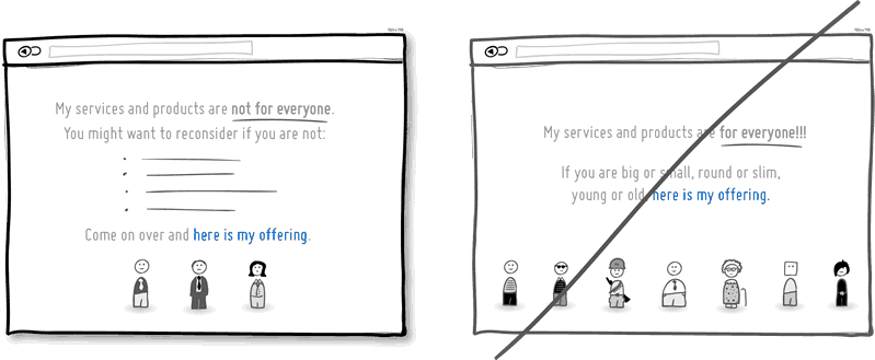
[mks_highlight color=”#3a962e”]This is a conversion idea, which shows explicitly whom exactly your product or service is intended for. [/mks_highlight]By communicating the qualifying criteria of customers, actually connect more with them while at the same time hinting at a feeling of exclusivity. The risk with this strategy, of course, is that you might cut yourself short and turn away potential customers, but then again
Remember that transparency builds trust.
[mks_separator style=”double” height=”5″]
Being Direct
[mks_separator style=”double” height=”5″]
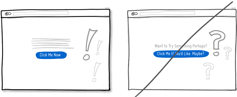
Send your message with confidence and exclude all uncertainty.
You have some opportunity to be a bit more authoritative so take it. There is always more room for telling people what to do next in the world of conversion optimization.
[mks_separator style=”double” height=”5″]
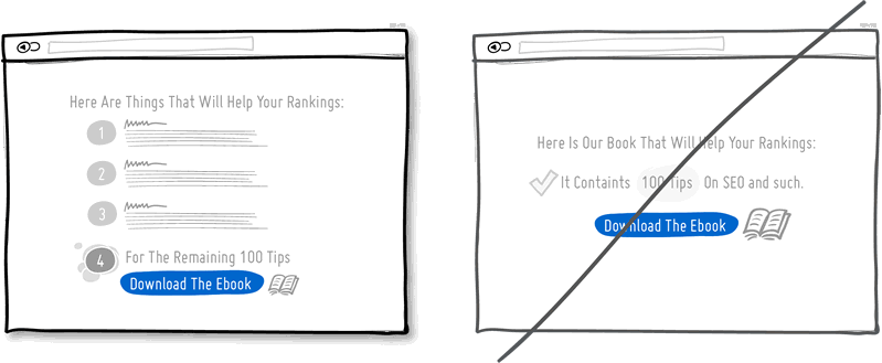
Benefit Buttons
[mks_separator style=”double” height=”5″]
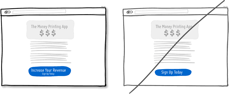
Benefit Buttons lead to higher conversions.
Alternatively, the benefit can also be [mks_highlight color=”#3a962e”]placed close to where the action button is placed in order to remind people of their chosen action.[/mks_highlight] Space can be made for task based action buttons, which can be reserved for interface areas that require less convincing and more recurrent.
[mks_separator style=”double” height=”5″]
Direct Menus
[mks_separator style=”double” height=”5″]
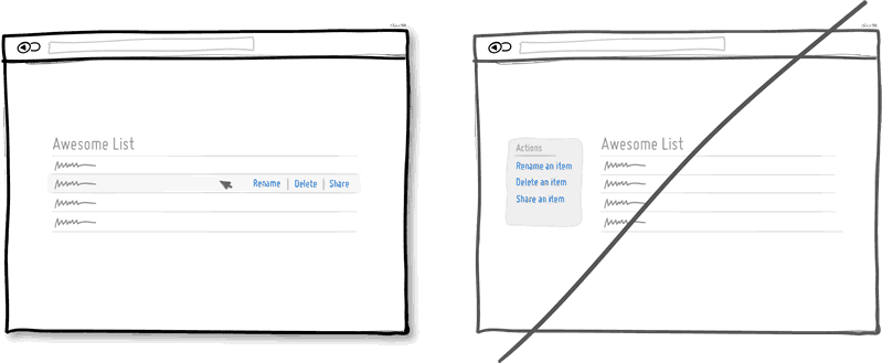
Display lists of data that allow the user choice to do something with the items in the given list.
[mks_highlight color=”#3a962e”]Such interactions cut through the number of required steps[/mks_highlight], compared to the same task that was started more generally without the context of the item – since selection is already taken care of.
[mks_separator style=”double” height=”5″]
Design For Zero Data
[mks_separator style=”double” height=”5″]
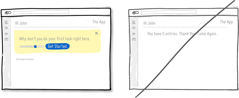
We often forget to design for the initial case when there is still nothing to display and by doing so you run the risk of neglecting users. [mks_highlight color=”#3a962e”]When first time users look at your app and all it does is show a blank slate without any guidance then you will probably miss out on an opportunity.[/mks_highlight]
Zero data states are just perfect for getting users across the initial hurdle of learning by showing them what to do next.
[mks_separator style=”double” height=”5″]
Consistent Content
[mks_separator style=”double” height=”5″]
Striving for consistency is one of the most well known principles.
As people press buttons and shift sliders, they learn to expect these interactive elements to look, behave and be found in the same way repeatedly. [mks_highlight color=”#3a962e”]Consistency solidifies the way to learn to interact[/mks_highlight] and as soon as it is taken away, they are then forced back into learning mode all over again. Consistent interfaces can be achieved through a wide possible range of things such as: colors, directions, behaviors, positioning, size, shape, labeling and language. Before making everything consistent, however, please, let’s bear in mind that keeping things inconsistent still has value.
[mks_separator style=”double” height=”5″]
Forgiving Inputs
[mks_separator style=”double” height=”5″]
Be more forgiving in terms of user-entered data; computers can move one step closer towards becoming a bit more humane. [mks_highlight color=”#3a962e”]Forgiving inputs anticipate and understand a variety of data formats and thereby makes your UI friendlier.[/mks_highlight]
Have your code work a bit harder so that your users won’t have to exert extra effort.
[mks_separator style=”double” height=”5″]
Try Story-Telling
[mks_separator style=”double” height=”5″]
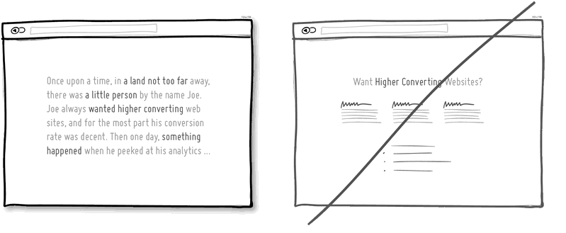
Instead of listing out the information in bullet point form; try a narrative.
A basic story should have a few simple elements such as a setting, a character with intentions, and some problematic situation just around the corner. [mks_highlight color=”#3a962e”]Stories elicit a more emotional response[/mks_highlight] by making it feel as if the written experience was actually encountered. Long form sales letters usually apply storytelling, which could be the reason why they are still effective to this day.
[mks_separator style=”double” height=”5″]
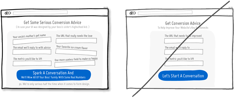
Concise Copy
[mks_separator style=”double” height=”5″]
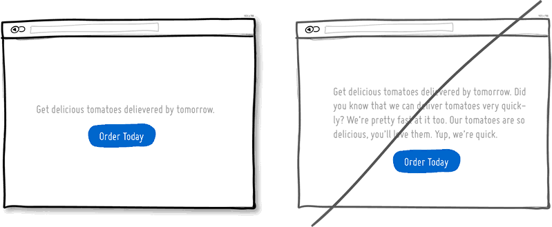
Get to the point by shorter sentences, using simpler and fewer words.
[mks_highlight color=”#3a962e”]After writing the first draft, check to see if it can be further condensed.[/mks_highlight] Showing the core message will convey what you intended without losing someone’s attention. Avoid the passive voice and meaningless words.
[mks_separator style=”double” height=”5″]
Authenticity
[mks_separator style=”double” height=”5″]
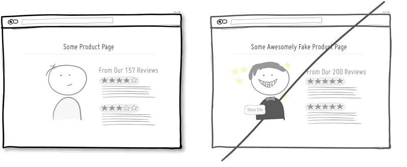
Authenticity may just be the cure in helping your product or screen in becoming trustworthier.
An area, which may often be a source of skepticism, is product reviews. [mks_highlight color=”#3a962e”]Having a mix of good and bad reviews as opposed to just the good ones, may also help.[/mks_highlight] Finally, having precise non-rounded numbers may also be perceived as more believable and attention catching.
[mks_separator style=”double” height=”5″]
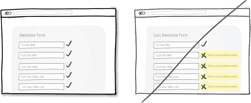
Inline Validations
[mks_separator style=”double” height=”5″]
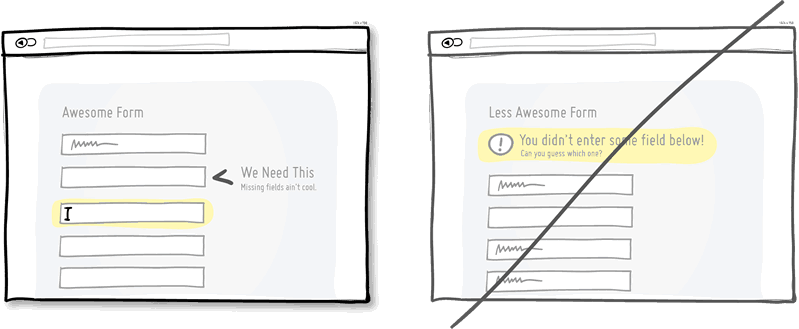
When dealing with forms and errors, try to detect if something isn’t correct and show it sooner rather than later.
The famous interaction pattern highlighted here of course is inline validation. [mks_highlight color=”#3a962e”]Show an error message as it is caught so it can be corrected right then [/mks_highlight]and there as it appears in context. On the other hand, when error messages are displayed later on it forces people to do some additional cognitive work of having to recall what they were doing a few steps back.
[mks_separator style=”double” height=”5″]
Scarcity vs Abundance
[mks_separator style=”double” height=”5″]
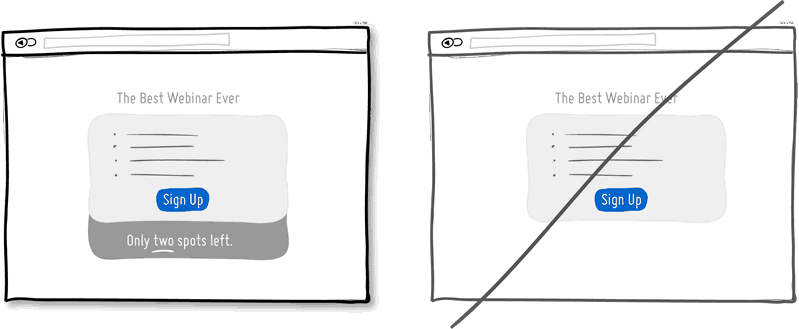
Scarcity suggests there was once a high demand for something.
Think of a wholesale store vs. a boutique and then look at how their pricing often compares. [mks_highlight color=”#3a962e”]All these things can be shown to the user to evoke action[/mks_highlight] while being more informed. It comes in the domain of supply and demand where less is always more.
[mks_separator style=”double” height=”5″]
Humor vs Formal Tone
[mks_separator style=”double” height=”5″]
Try to lighten up by throwing in a joke or something playful here and there.
Adding humor to your UI might prove useful when it does work, however, the [mks_highlight color=”#3a962e”]humor builds up a stronger human relationship [/mks_highlight]between you and your users/customers.
[mks_separator style=”double” height=”5″]
Calculations
[mks_separator style=”double” height=”5″]
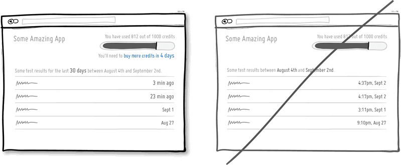
Use a user interface to carry out mathematical calculations, large or small, for users and thus remove unnecessary friction.
In this case a relative time stamp of “3 min ago” has more meaning and requires less effort to comprehend than, say an absolute one of “4:37pm, Sept 2″. [mks_highlight color=”#3a962e”]Remove the extra effort of your user to earn points.[/mks_highlight]
[mks_separator style=”double” height=”5″]
Curiosity vs Reservation
[mks_separator style=”double” height=”5″]
Stirring curiosity is a conversion tactic, which tries to drive need or wish of something by providing a bit of teasing information.
Teasing your users, customers with samples and hooks, leads to people wanting to continue on the path of action. Perhaps giving people a full trial, or all of an X out of Y before they are customers isn’t the best way to motivate them. [mks_highlight color=”#3a962e”]Keep them hungry for more always and pique their interest where possible.[/mks_highlight]
[mks_separator style=”double” height=”5″]
Natural Language
[mks_separator style=”double” height=”5″]
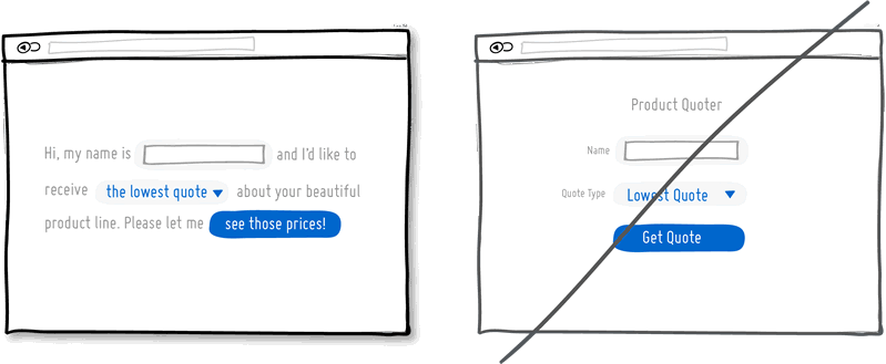
Natural language is a more informal and conversational interaction style than just short, strict and formal words.
The expectation becomes twofold. First, a person types in a phrase, which the computer would ideally comprehend the full meaning of. Second, the responses from the computer are also more conversational and friendly in return. As for interfaces, which display their messages as conversations, there are some hints that they might convert just a bit better.
[mks_separator style=”double” height=”5″]
Progressive Disclosure
[mks_separator style=”double” height=”5″]
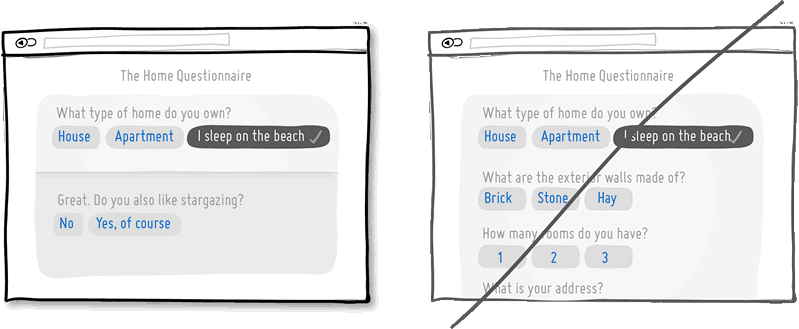
Progressive Disclosure protects the user from too much irrelevant information.
It’s a pattern, which only shows information gradually if it makes sense to do so usually in the context of forms. Too many fields to increase effort and scare people away so this is another tactic of avoiding having to enter unnecessary fields. [mks_highlight color=”#3a962e”]Only show/ask for what is relevant to the situation at hand. [/mks_highlight]
[mks_separator style=”double” height=”5″]
Thank Your Customers
[mks_separator style=”double” height=”5″]
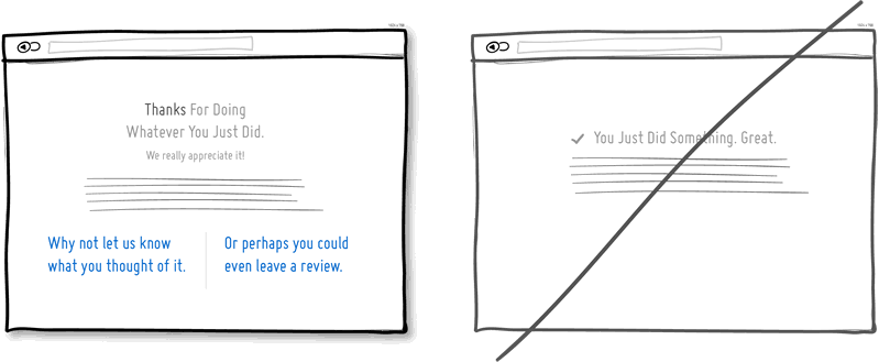
Thanking people can make you, your business, product or UI feel more human as it shows how much you appreciate and care.
Thanking of course comes at the end of some sort of task completion and definitely is bigger than just plain feedback. So naturally, [mks_highlight color=”#3a962e”]thank you screens are a perfect spot to suggest the next optional action for the customer or user to take.[/mks_highlight]
______________________________________________________________________________
Source: www.goodui.org