22 Things Which Create A Perfect Layout
[mks_separator style=”double” height=”5″]
Single column layout vs. multi-column
[mks_separator style=”double” height=”5″]
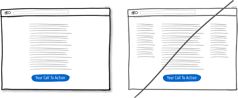
A single column layout provides you with more control over your narrative. [mks_highlight color=”#ce672b”]Single column layout guides your readers in a more predictable way[/mks_highlight] from top to bottom whereas a multi column approach runs some risks of distracting the readers from the core purpose of the page.[mks_separator style=”double” height=”5″]
Distinct Clickable/Selected Styles
[mks_separator style=”double” height=”5″]
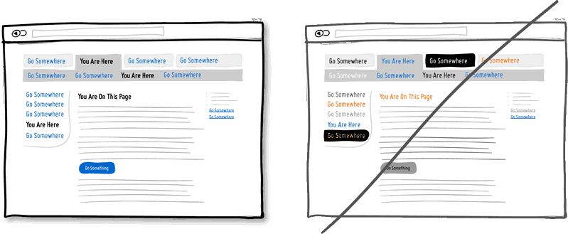
Visual styling such as color, depth, and contrast can be used as a reliable cue to help people understand the fundamental language of navigating the interface. In order to communicate clearly with your users, [mks_highlight color=”#ce672b”]the styles of your clickable actions (links, buttons), selected elements (chosen items), and plain text should be clearly distinct from one another.[/mks_highlight] It should also be applied consistently across the interface.[mks_separator style=”double” height=”5″]
Try Contrast
[mks_separator style=”double” height=”5″]
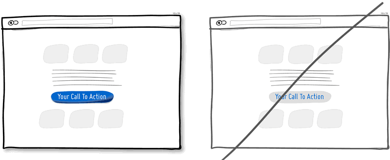
Want a stronger UI? Make your calls to action be a bit more prominent and distinguishable in relation to the elements surrounding them. You can easily increase the contrast of your primary calls to action in a number of ways. [mks_highlight color=”#ce672b”]Use tone; make certain elements appear darker vs. lighter.[/mks_highlight] With depth, you can make an item appear closer while the rest of the content looks like it’s further (talking drop shadows and gradients here). You can also pick complementary colors from the color wheel to increase contrast even further. Consider a higher contrast between your call to action and the rest of the page.[mks_separator style=”double” height=”5″]
Form Fields
[mks_separator style=”double” height=”5″]
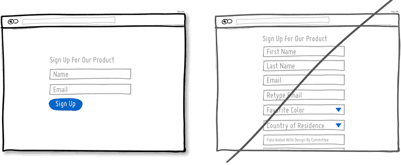
If you ask your users to fill out various fields then you will probably run the risk of making your visitors turn around and give up. Not everyone can type at a high speed. [mks_highlight color=”#ce672b”]Question yourself if each field is really necessary and remove as many fields as you can.[/mks_highlight] If you have numerous optional fields, then consider moving them after form submission on a separate page.[mks_separator style=”double” height=”5″]
Expose Options
[mks_separator style=”double” height=”5″]
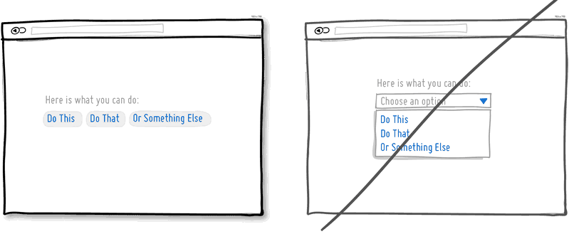 Pull down menus hide an extra set of actions which require additional effort to be discovered. If these hidden options are really central to getting things done by your visitors, then you should consider having them up front. [mks_highlight color=”#ce672b”]Reserve pull down menus for options that are predictable.[/mks_highlight] Just be careful to use drop downs for primary items that are on your path to conversion.[mks_separator style=”double” height=”5″]
Continuity vs. False bottoms
[mks_separator style=”double” height=”5″]
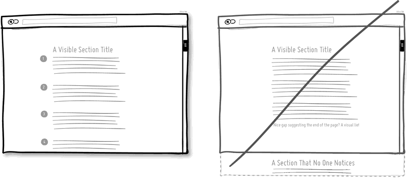
A false bottom is never the right way to go. Yes, scrolling long pages are great, but be careful of giving your users a sense that the page has come to an end when it really hasn’t. [mks_highlight color=”#ce672b”]Try to establish a visual pattern or rhythm that the user can learn and rely on to read further down.[/mks_highlight] Secondarily, be careful of big gaps around the areas of where the fold can appear. Over all it is about authenticity and not duping your users.[mks_separator style=”double” height=”5″]
Do not create links
[mks_separator style=”double” height=”5″]
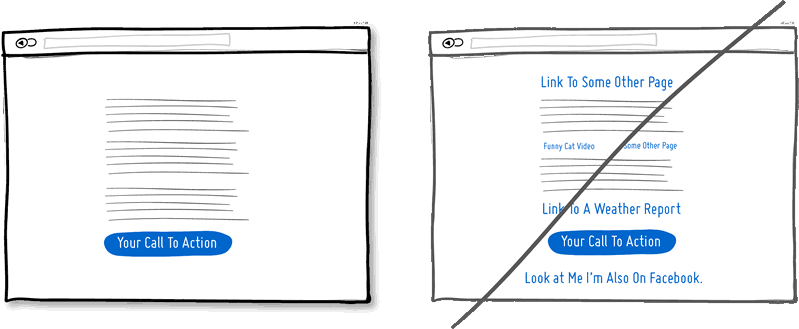 Think again if your narrative page points towards a specific call to action at the bottom. Keep an eye on the number of links on your pages and possibly balance discovery style pages (a bit heavier on the links) with tunnel style pages (with fewer links and higher conversions). [mks_highlight color=”#ce672b”]Remove extraneous links to increase a user’s chance of reaching that important button.[/mks_highlight][mks_separator style=”double” height=”5″]
Expose Fields
[mks_separator style=”double” height=”5″]
 [mks_highlight color=”#ce672b”]Merge the sign up forms with the landing page so a number of benefits can be made[/mks_highlight] in comparison to creating separate multi-page sign ups. First, you are cutting out extra steps from the flow in general. Secondly, by showing the number of form fields right there, you are providing the customer with a sense of how long the sign up actually is.[mks_separator style=”double” height=”5″]
Try Transitions
[mks_separator style=”double” height=”5″]
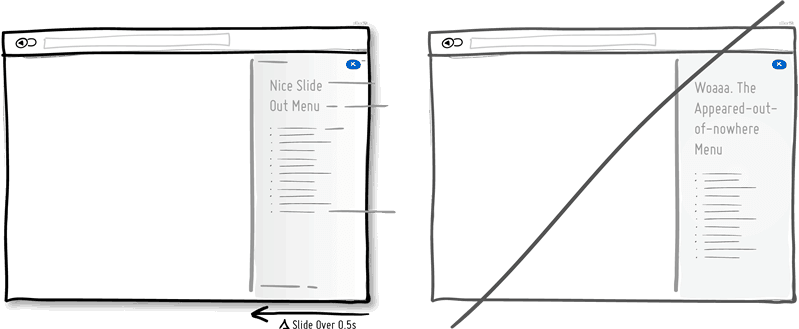 Interface elements often appear, hide, move, shift, and resize as users do their thing. As elements respond to our interactions, it may sometimes be easier to comprehend what just happened when we sprinkle in the element of time. [mks_highlight color=”#ce672b”]A built in intentional delay in the form of an animation or transition, respects cognition and will give people the required time to understand a change in size or position.[/mks_highlight] Yet keep in mind that the people who just wish to get things done quickly, too long of a delay of course can be a burden.[mks_separator style=”double” height=”5″]
Try Gradual Engagement
[mks_separator style=”double” height=”5″]
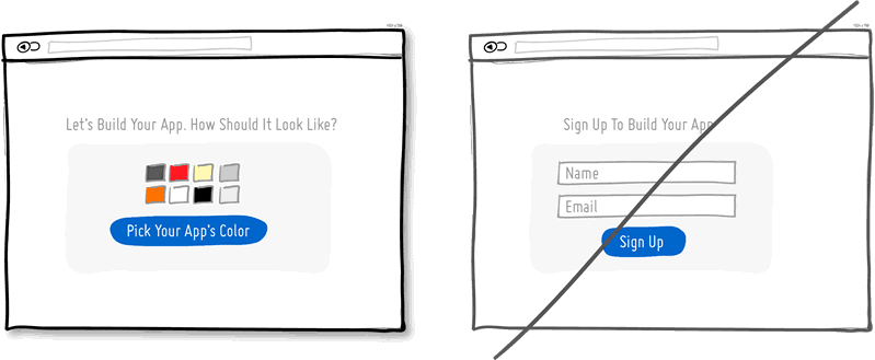 Instead of asking visitors to sign up immediately, why not ask them to first perform a task? During such initial interactions you can both show off the benefits of the product as well as of personalization. [mks_highlight color=”#ce672b”]Once users begin to see your product’s value, they are more likely to make it their own.[/mks_highlight] Gradual engagement is the way to postpone the sign up process as much as possible and still allow users to use and customize your application/product.[mks_separator style=”double” height=”5″]
Few Borders
[mks_separator style=”double” height=”5″]
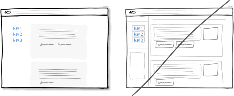 Borders compete for attention with real content. Borders can be used to define a space very clearly and precisely. [mks_highlight color=”#ce672b”]Define the relationships between screen elements which use less attention and other elements[/mks_highlight] which can be just grouped together through proximity, be aligned, have distinct backgrounds, or share a similar typographic style. Pages with lots of boxes tend to look noisy or misaligned. It is helpful to throw in a line here and there. But consider alternative ways of defining visual relationships that are less taxing to attention.[mks_separator style=”double” height=”5″]
Visual Hierarchy
[mks_separator style=”double” height=”5″]
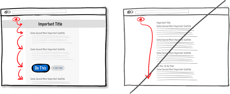 [mks_highlight color=”#ce672b”]Use a good visual hierarchy to separate out your important elements from the less important ones.[/mks_highlight] A visual hierarchy results from varying things as alignment, proximity, color, tone, indentation, font size, element size, padding, spacing, etc. If these visual language elements are applied correctly, they work together to direct and pause people’s attention within a page. With a good visual hierarchy, you will invite your users to spend a bit more time on the page.[mks_separator style=”double” height=”5″]
Click Areas
[mks_separator style=”double” height=”5″]
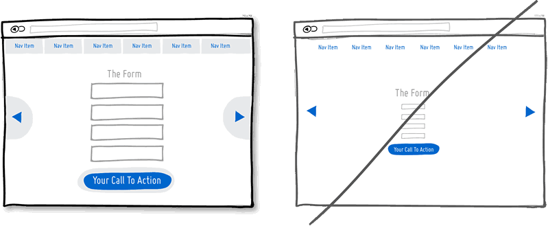 [mks_highlight color=”#ce672b”]Make Links, forms and buttons easier to click on by increasing their size.[/mks_highlight] Do consider increasing your form fields, calls to action, and links. Alternatively, also keep the visual element looking as is, but instead only increasing its hotspot or clickable area.[mks_separator style=”double” height=”5″]
Multifunctional Controls
[mks_separator style=”double” height=”5″]
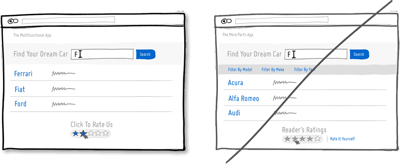 Simplicity is valuable in design as it somewhat correlates with ease of use. Too much clutter will result in limited attention pools. The more parts there are, the greater is the room for usability issues to creep up. One way for you to achieve the same with less is to [mks_highlight color=”#ce672b”]make UI controls more multifunctional. [/mks_highlight]That is, you take one control and you squeeze two or more functions into it. It’s therefore probably better to reserve the multifunctional approach for repeat visitors who can deal with a slightly higher learning curve. Also, use it wisely and don’t overdo it. [mks_separator style=”double” height=”5″]
Extra Padding
[mks_separator style=”double” height=”5″]
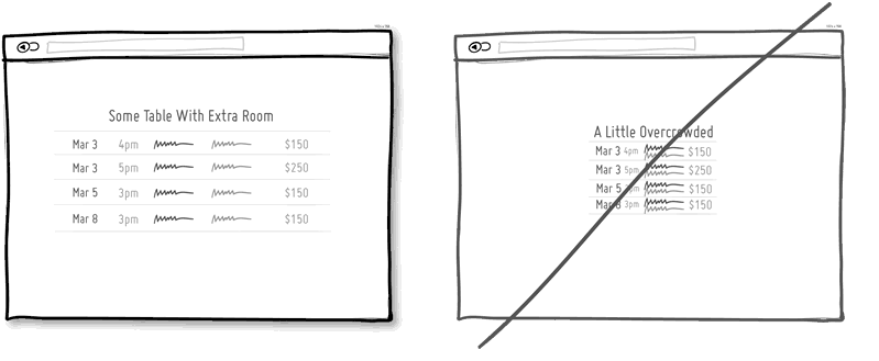 White space definitely makes content and/or data more readable. When elements are slightly separated away from each, they begin to be allowed to be perceived individually. This is good for lists, tables, paragraphs or any sets of elements on a screen. [mks_highlight color=”#ce672b”]One common way of applying white space is with extra padding all around an item.[/mks_highlight] Without adequate padding on the other hand, elements begin to blur together into indistinguishable wholes. Therefore, when readability is concerned use padding to help.[mks_separator style=”double” height=”5″]
Responsive Layouts
[mks_separator style=”double” height=”5″]
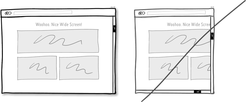 Double scroll bars create a lot of confusion. Confusion might also be caused unintentionally due to static layouts when looking at UIs on smaller devices. One way to solve this problem is [mks_highlight color=”#ce672b”][/mks_highlight]making responsive layouts that adjust automatically for various screen shapes and sizes.[mks_separator style=”double” height=”5″]
Smart Defaults
[mks_separator style=”double” height=”5″]
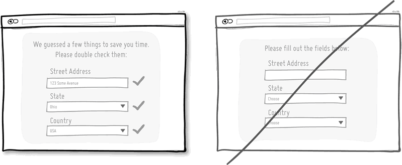 Use smart defaults or pre-filling form fields with educated guesses to remove the amount of work users have to do. This is a common technique for helping users move through forms faster. One of the worst things you can do is to ask people for data that they have already provided in the past, repeatedly over and over again. [mks_highlight color=”#ce672b”]Try to display fields that are preloaded with values to be validated[/mks_highlight]as opposed to asking for values to be retyped each time. The less work, the better.[mks_separator style=”double” height=”5″]
Group Related Items
[mks_separator style=”double” height=”5″]
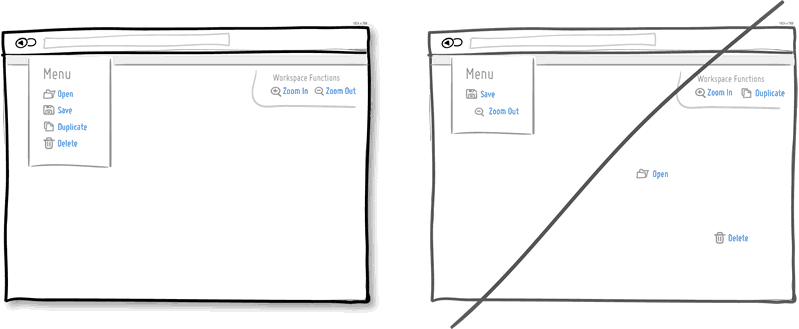 Grouping related items together is the most basic way to increase fundamental usability. We know that open and save functions can typically be found more or less together. [mks_highlight color=”#ce672b”]Related items are just meant to be placed in proximity of each other in order to respect a degree of logic[/mks_highlight] and lower overall cognitive friction. Wasting time looking for stuff usually isn’t fun for people.[mks_separator style=”double” height=”5″]
Keyboard Shortcuts
[mks_separator style=”double” height=”5″]
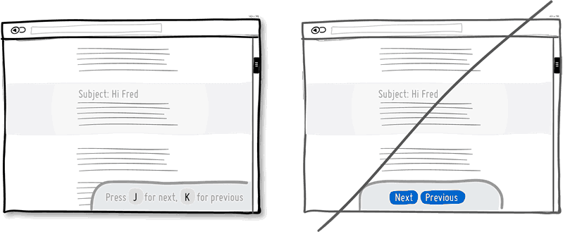 When you have a high use product, it’s always good to consider those advanced users who keep coming back and spend much time with your application. People often seek ways which allow them to perform repetitive task quicker and keyboard shortcuts are one such way of providing this. [mks_highlight color=”#ce672b”]Hot keys speed up task performance over point and click graphical user interfaces dramatically.[/mks_highlight][mks_separator style=”double” height=”5″]
Progressive Reduction
[mks_separator style=”double” height=”5″]
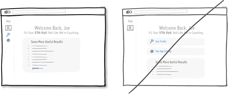 Progressive Reduction means that users learn to use your interface, the functions which were more important to them in the beginning, become easier or less important over time. For example, [mks_highlight color=”#ce672b”]certain on-boarding related calls to actions may be moved further away as room is made for other content.[/mks_highlight] Or, icon labels may become hidden as the meaning of icons becomes understood. People learn to use an interface and the progressive reduction pattern respects that.[mks_separator style=”double” height=”5″]
Grab Attention
[mks_separator style=”double” height=”5″]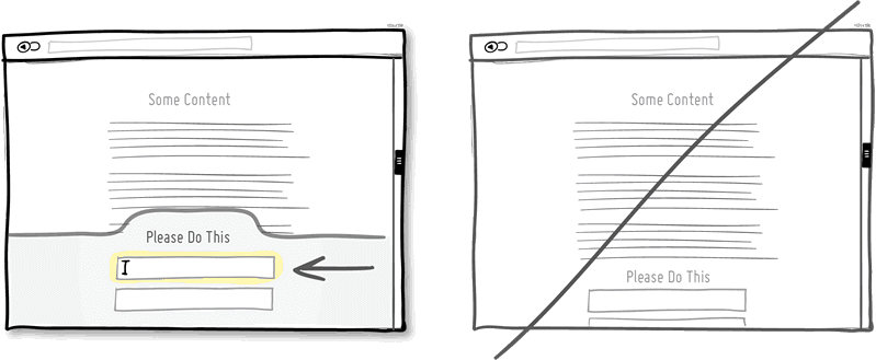
Channel additional attention towards the most important actions. This can be achieved in numerous ways; by [mks_highlight color=”#ce672b”]starting with the more obvious size increase or higher contrast of an element.[/mks_highlight] Other ways for directing attention also include: using irregular shapes, field auto focusing, section highlights, sticky element interactions (floating), as well as directional arrows. Emphasize the primary calls to action. It is always worth it.[mks_separator style=”double” height=”5″]
Display Progress
[mks_separator style=”double” height=”5″]
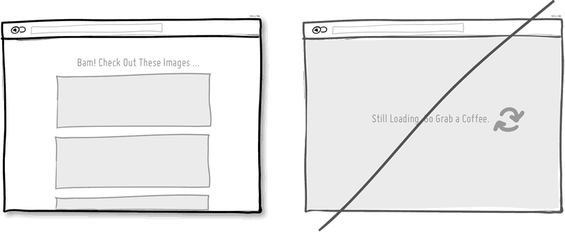 This increases the motivation for getting things done once we are closer to completion. [mks_highlight color=”#ce672b”]Make people feel progress sooner rather than later.[/mks_highlight]This will help you by making your users more receptive and appreciative for their time spent.
Source: www.goodui.org
[bibblio style=”bib–font-arial bib–size-18 bib–recency-show bib–default bib–hover bib–shine bib–white-label bib–grd-6″ query_string_params=”e30=” recommendation_type=”optimised”]
- Categories:
- Ecosystem
